Appearance
Settings → Appearance decides what plMail looks like for you and nobody else. Every control applies as you touch it and saves itself — there is no Save button on this page.
The two axes
The theme picks the palette; the layout picks how it is painted. They are independent, which is why they are two controls rather than one long list.
Theme offers System, Light, Paper, Dark, Nord, Dusk and Solar, each shown as a swatch of its own colours. A new account starts on Paper rather than System: "follow the OS" resolves to whichever of plain white or plain dark the machine happens to prefer, which are the two least considered palettes here. Picking System is still there for anyone who wants the operating system to decide, and it is resolved in the browser so the page never flashes the wrong one on load.
Layout is Flat or Boxed. Flat puts the top bar and sidebar straight on the background and keeps only the main pane boxed; Boxed floats every panel as a card. Choosing one moves the sliders below it to that layout's own numbers, so the two never end up describing a state neither layout would produce. Flat is the default.
The logo
The "pl" mark has thirty-two colourways — single colours, two-tone pairs, ink with one coloured flick, and gradients that sweep across the strokes — and Logo lets you pick yours. The choice follows you everywhere the mark appears: the top bar wears it at once, and the tab icon is served in your colourway too, so the browser tab matches the page it opens. A new account starts on Berry, the product's own sweep. Dark themes get each colourway's dark-chrome strokes, so an ink-dark mark never disappears into a dark top bar.
The live preview
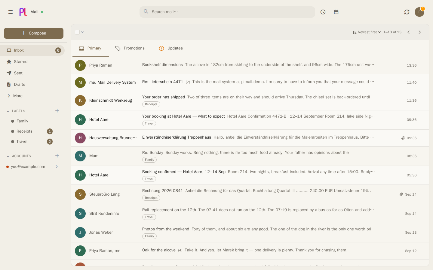
Beside the controls sits a second card showing a sample sidebar, message list and reading pane in whatever you have currently chosen. Every change lands in it as you make it. Nothing in it is your mail — the rows are invented, and the preview never loads a message.
The boundary between the two cards can be dragged, from 240 to 900 pixels, and where you leave it is remembered against your account rather than the browser, so the page opens at your width on the next visit and on the next machine. Arrow keys move it too, and a double-click puts it back to its default of 304.
The maximum is a ceiling rather than a promise. The controls card will not be squeezed below its own floor, so the preview widens into whatever the window has spare and stops earlier on a narrow one — at 1280 pixels it reaches about 374 however far you drag.
On a narrow screen the preview is not shown beside the controls at all. Show preview in the settings card's header reveals it above them instead, leaving every control where it was, and Hide preview puts it away. That one is deliberately not remembered: it starts closed on every load, because it is a peek rather than a decision about how the page should be shaped.
What a list row shows
Message list decides how much each row in the mail list carries. Every default is what the list already did before these controls existed, so nothing moves until you change something.
| Control | What it does |
|---|---|
| Account corner | The coloured triangle in a row's lower-left saying which account the message arrived on. On by default; it is only ever drawn in a list that mixes accounts anyway |
| Sender discs | The coloured circle carrying the sender's initial — see the trap below, this one does not disappear |
| Preview lines | None, One line or Two lines of the message body under the subject |
| Unread rows | Subtle, Standard or Strong — how loudly the list says a row is unread |
Unread rows changes the tint behind the row and the accent bar beside it, and nothing else. The bold sender and subject stay at every setting on purpose: bold is the signal that survives a colour-blind reader, a translucent pane over a photograph, and a printout, and it is not worth trading away. Subtle removes the tint entirely, Strong deepens it and adds a bar down the row's leading edge.
Two lines is the ceiling because the row only has room for two, and the second line is only ever drawn in the stacked layout — on a wide screen the subject and the preview share a single line by design, so a second one there would push the subject off its own row.
Typography
Typeface offers System, Grotesque, Serif and Monospace. Every one of them is a stack of fonts the machine already has: plMail ships no webfont and fetches none, so the picker works the same on an install with no outbound internet access, and changing it costs no download. System is the default and is the one that looks native on whatever you are reading this on; the other three are a preference rather than an upgrade.
Text size scales the whole interface between 0.875 and 1.25. Both ends are where the app was actually opened and looked at rather than where a round number fell — nothing clips at the small end and nothing overflows at the large one, though the settings navigation wraps onto more lines near the top.
The compose window is deliberately outside it. The editor keeps its own font and size whatever you set here, because a size chosen in the compose window is per-message formatting: it is written into the message's HTML and goes out to the recipient. Someone writing a message needs to see what they are sending, not what they set on this page.
Motion
Motion is Full, Minimal or None, and it decides how much the interface moves when something appears — a message arriving in the list, the compose window opening, a menu dropping down.
- Full — things arrive from somewhere and settle. Almost everything is done inside a quarter of a second. The mail list is the exception, twice over, and the two sections below are about that.
- Minimal — the same cues, as a fade, with nothing moving and nothing displaced. Slightly faster than Full, because without travel there is less for the eye to follow and the same duration starts to read as a lag.
- None — exactly what plMail did before any of this existed.
Opening a folder, running a search or turning a page is the other one, and it is the opposite shape. Each row drops into place in about two frames — far too fast to watch — but they do it one after another, so what you see is a cascade running down the list rather than any single row moving. The list itself does not animate: a grey rectangle fading tells you a rectangle changed. It is capped at eight rows, so a list of fifty and a list of six both finish in about a sixth of a second.
New mail is the exception
One thing takes noticeably longer than everything else, and it is deliberate: a conversation that has genuinely just arrived drops into the list from above, the rows below it moving down to let it in. The whole gesture runs about eight hundred milliseconds — several times anything else in plMail.
It is affordable because it is rare. The list is redrawn constantly, after every star, archive, bulk action and sync, and none of that plays this. Only mail that has never been on your screen before does, which on a normal mailbox is a handful of times an hour.
At Minimal it collapses to the same short fade as everything else: no drop, no travel, no wait.
The one thing it costs
New mail takes about half a second to land, and something moving can be reached for and missed. The row keeps its full width and stays on its own line the whole way, so clicking the middle of it does what it looks like it does — but the select box at the far left and the hover actions at the far right are travelling, and until it settles they are not quite where they will be.
Nothing is ever frozen and no click is ever thrown away. It is simply possible, in that half second, to click a piece of empty list rather than the control on its way to that spot. Opening a folder does not have this problem: that one is over before a hand has moved.
If it bothers you, the setting above is the answer, and it is why the setting exists: Minimal keeps the cues and removes every pixel of travel, and None removes the animation.
If your system asks for reduced motion, that wins — whatever is set here, and without asking. Somebody who has told their operating system that movement makes them ill has not asked plMail for its opinion.
Density, and giving a pane its own
Density is Comfortable, Cosy or Compact, and it sets row height and spacing across the app. Under it, the Sidebar, the Message list and the Reading pane can each Follow that global choice — which is what they all do until you say otherwise — or take one of the three for themselves.
Density is the only setting that works this way, and the reason is structural rather than a shortage of controls: the message list and the reading pane are one painted surface, sharing a background, a blur and a border, so opacity or corner radius cannot differ between them without splitting that pane in two. Density can, because it is padding inside rows rather than a property of the surface they sit on.
On a touch device each pane holds its own Comfortable row height whatever density you pick, so choosing Compact on a phone never costs you tap-target area.
The rest of the controls
| Section | What it sets |
|---|---|
| Main pane | A background tint and opacity for the content area on its own, or Match glass opacity to follow the panels |
| Glass | Panel opacity, Window and menu opacity, Blur, Corner radius and Background dimming — how much of the background shows through your panels |
| Text | Text colour plus Muted and Faint, or Auto-derive to have those two worked out from the main one |
| Accent colour | The single highlight colour, as a hex value |
| Background | Theme default, a flat colour, one of eight supplied images, or Upload image |
Two opacities, not one
Panel opacity is the layout: the sidebar, the top bar, the main pane and the calendar. Window and menu opacity is everything that floats over that layout: the compose window, dialogs and menus.
They are separate because a floating surface has one more layer behind it than a panel does. A menu sits on a panel that is already letting the background through, and the two translucencies multiply — at the same setting on both, a tenth of the picture behind them survives both layers and lands in the middle of the text. So window and menu opacity starts fully solid and will not go below 0.5, however far the panels are taken down. Menus and dropdowns have always been drawn solid for this reason; the difference now is that it is a value you can change rather than a rule you cannot.
Each numeric control is bounded, so a value typed or imported from outside the sliders is clamped rather than honoured: panel opacity between 0.15 and 1, window and menu opacity between 0.5 and 1, blur between 0 and 60 pixels, corner radius between 0 and 2 rem, background dimming between 0 and 0.7, and the text scale between 0.875 and 1.25.
The accent colour has to be a six-digit hex value with a leading #. Anything else falls back to
the default rather than being stored, and the same is true of the three text colours and the main
pane tint, which become "unset".
Backgrounds
Four kinds: the theme's own, a flat colour you pick, one of eight supplied images, or an upload of your own.
Upload image accepts JPEG, PNG and WebP. The file is stored per user, and uploading a new one deletes the previous one — there is no gallery of past backgrounds.
All four apply the moment you choose them, and apply exactly what a reload would apply. There is no step where the setting has saved and the screen has not caught up.
Choosing anything but the theme's own raises the panel opacity floor to 0.45 whatever the slider says, in both the panels and the main pane. Below that, text on top of a photograph stops being readable, and a legible interface is worth more than the last of the transparency. That floor travels with the background too: going back to the theme default releases it there and then rather than on the next reload.
Export and import
Export theme downloads plmail-theme.json. Import theme takes one back. Reset to
defaults puts everything back where a new account starts.
The export carries the version, the theme, the layout, the accent, all five glass numbers, the density and the three per-surface density overrides, the mail-list settings, the typeface and text scale, the background choice, the text colours and the main pane settings. It deliberately does not carry your uploaded background image: a filename on someone else's install means nothing, so a custom background exports as Theme default.
It does not carry the preview pane's width either. That is a preference about how this settings page is shaped rather than part of how the app looks, so importing somebody else's theme leaves your own preview exactly where you left it.
Import checks the version and refuses a file that is not version 1. Anything in the payload that is not a value plMail recognises is ignored rather than stored, and a layout in the file is applied before the individual numbers, so an export written before a control existed still lands somewhere sensible.
Language
Settings → General → Language sets the language the interface is shown in. Your mail is left exactly as it was written — nothing is translated, and nothing is rewritten.
plMail ships English, Deutsch and Pirate English. Changing it reloads the page rather than patching it, because every string on screen has to be re-rendered.
The same section carries Time zone, which decides the clock times and dates you are shown. It too rewrites nothing — the same instant is simply read on your own clock — and it can be left on the server default.
Under it, Clock decides whether those times are written on a twelve- or a twenty-four-hour
clock: 2:30 pm or 14:30. It applies everywhere a time appears — the mail list, a thread, a
calendar chip, the agenda, the day grid's hour axis — because a setting honoured in most places and
not in one reads as a bug rather than as an option.
Its default is Follow your language, which is what everyone is on until they change it: German reads 14:30, English reads 2:30 pm. That is a real state and not a value in disguise — leave it there and switching language switches the clock with it. Choosing one of the two explicitly pins it, whatever the language later becomes.
Where to read further
- Mail — the lists and panes these settings paint.
- Other clients — a third-party app has its own appearance; this is the web UI only.
- Client development — the two-axis model, its semantic colour tokens, and how to reproduce them, for anyone building a client that should look like plMail.
Things that bite
A custom background does not survive an export. It is excluded on purpose, since the file lives on this install and a filename would not resolve anywhere else. An import of your own export therefore leaves you on the theme default until you upload the image again.
The opacity slider stops mattering under a photograph. Anything below 0.45 is silently raised while a non-theme background is in use — including a flat colour. The slider still moves; the rendering does not follow it all the way down.
Sender discs cannot be switched off, only emptied. That disc is the row's checkbox: the real input sits behind it and every bulk action in the toolbar reads it. Switching it off paints over the identity — the colour and the letter go — and leaves a plain outlined circle in the same place, so the selection target and the row's geometry are exactly where they were. A row with no disc at all would be a row you cannot select.
The account corner only ever appears in a list that mixes accounts. On a single-account install it has never been drawn, and switching it on will not make it appear. Nothing is broken; there is simply no ambiguity for it to resolve.
Text size does not reach the compose window. The editor keeps its own font and size on purpose, because that size is formatting that ends up in the sent HTML. Making the interface larger will not make the message you are writing larger, and it should not.
Only density can differ between panes. The sidebar, the message list and the reading pane each get their own row height; opacity, blur, radius and the rest stay global. The list and the reading pane are one painted surface, so there is nowhere for those to differ.
Compact does not shrink rows on a phone. Every pane holds its Comfortable height on a touch device, so the setting looks as though it did nothing there. It did — on every pointer device you use the same account from.
The preview will not always reach 900. It widens into what the window has spare, and the controls beside it have a floor they will not go below. On a 1280-wide window the boundary stops around 374. Dragging it and finding it will not go further is the clamp working, not a stuck handle.
The preview's width is remembered; whether it is open on a phone is not. The width follows your account to every device. Show preview on a narrow screen starts closed every time you open the page.
Picking a layout overwrites the glass sliders. That is what the layout control is — a preset for those numbers. Set the layout first, then the numbers, not the other way round.
A hex value that is not six digits is not an error, it is a fallback. The accent silently returns to the default and the three text colours silently become unset, so a typo looks like the control having no effect.
Import refuses anything that is not version 1. There is no migration of older or newer files; the answer is a rejection rather than a partial apply.
Appearance is per user, not per device. There is no way to have the dark theme on the phone and the light one on the desktop except by choosing System and letting each device decide.